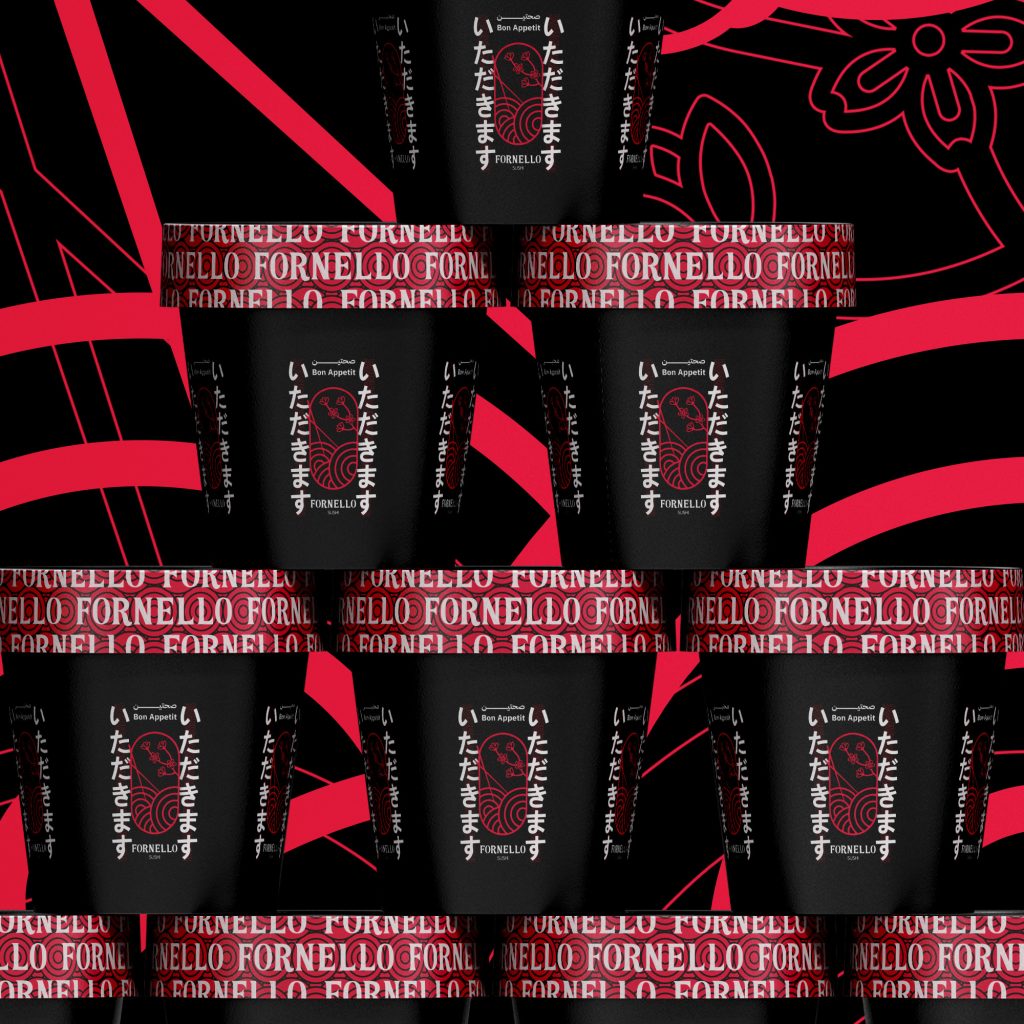
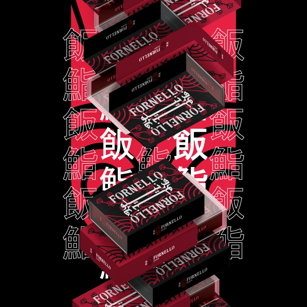
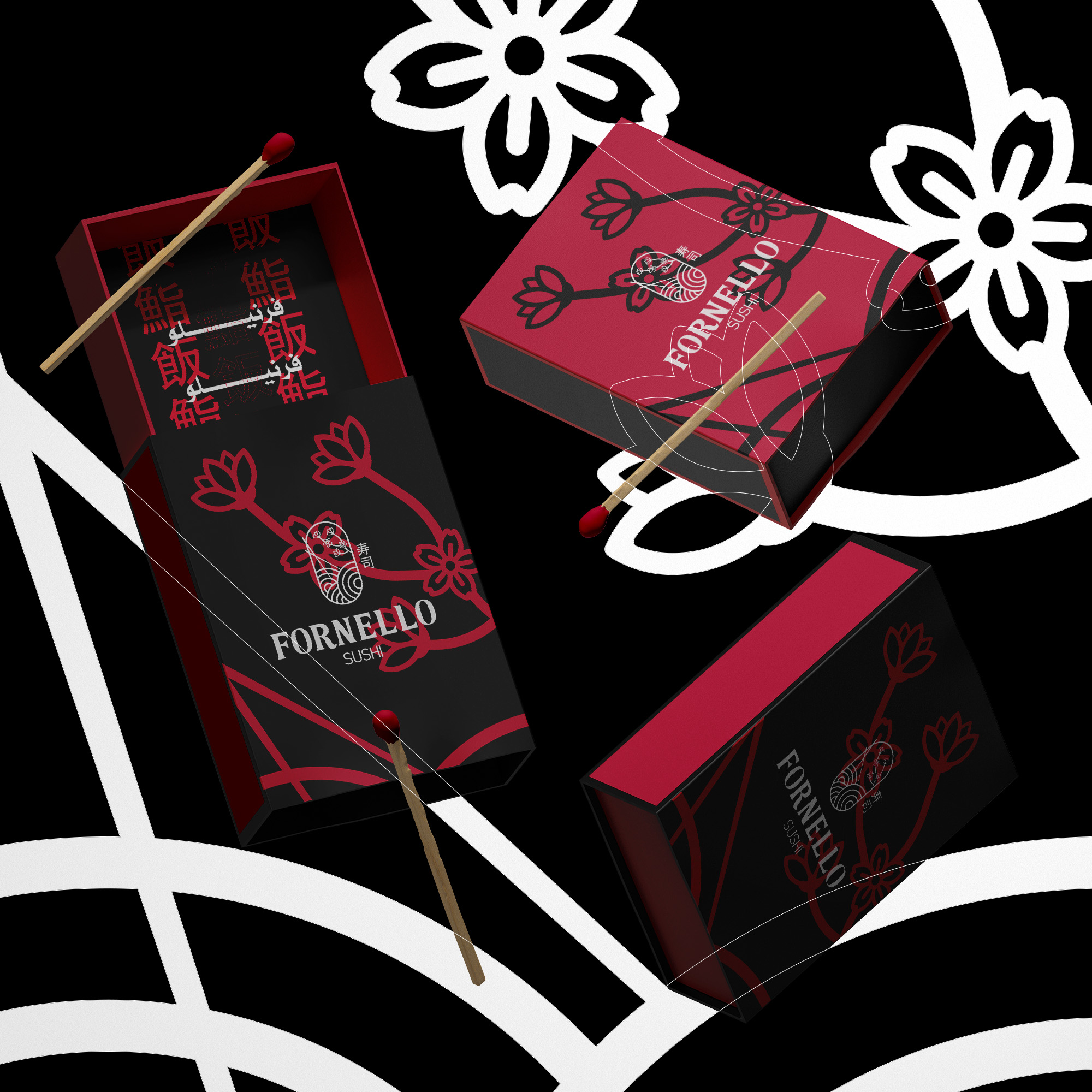
We created the logo to tell Fornello’s story: we used the Japanese personal seal “Hanko” to express Fornello’s uniqueness and the name that has become a distinctive mark and identity for Asian cuisine in Libya. We celebrated the reopening using the Japanese lotus flower, which blooms again and again no matter the surrounding conditions. Of course, sushi, which Fornello prides itself on as a central dish, was present with chopsticks in the logo, ready to be devoured immediately (as is the case in Fornello’s new branch). Fornello, in its new identity, is more stable, stronger, and more luxurious. To express this, Japanese culture helped us again with the symbolism of the colors red, black, and white, the colors of the Japanese empire, its architecture, and traditional clothing. Colors of strength, protection, and stability


